 Gray is really the new neutral in home interiors. Some may think of gray as gloomy, dull and boring, but really it can be very sophisticated, clean, alluring and very hip. It can go in almost any room….living room, bathroom, bedroom, kitchen and yes, in my case a nursery.
The beauty of the color gray is that it goes with any color in the rainbow! I knew gray walls or a color with a big dose of gray was the direction I wanted for Siona’s space because of two main reasons 1) the inspiration piece, the vase, has a gray/ green tone and 2) I knew I wanted to infuse colorful pattern for the bedding….gray was going be the perfect backdrop to showcase this pattern and splash of color!
The one thing I find tricky about gray as a paint color is that it comes in about thousands shades and these shades have a huge spectrum of undertones and really are very quite different from one another. Grays can have brown, yellow, green, purple, blue, silver tones so when picking the shade of gray keep this in mind:
Study several gray samples you can and put them side by side. This can be overwhelming, but try to narrow it down to no more than five samples when it comes to painting samples on the wall/test sample board and ask yourself the following:
- What feeling do you want to have in the room? Warm (brown, yellow undertones) or Contemporary (blue and silver undertones)
- How much sunlight/daylight does the room get? A lot of natural light? A silver gray will make the room glow. Southern facing room? A blue gray will ‘cool off’ a hot southern facing room. Windowless room? A subtle gray will help open up the room.
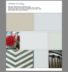
The vision board noted above illustrates the paint samples that were my final contenders based on the three elements that had made it in the room at the time… ‘the’ vase of course, my son’s old bronze wrought iron crib and the amazing bold chevron marine blue rug .
You may notice that I picked grays with yellow, blue and green undertones. I was all over the place, but ultimately I wanted a fresh, yet still warm look (yes, I want it all). Oddly enough I picked the Benjamin Moore color, Silver Crest 1583 described as “a generous dose of gray gives elegance to this very light shade of green. Evocative of the prized Silver Crest milk glass, it is delicate yet durable.” So maybe I picked a green? Go figure! Trust me though…on the wall it looks gray and then in some light it looks a bit green. I think the important thing here is that inspiration vase ended up being my guiding force in finalizing the paint color. Who knew!? Again, for me, the design story and inspiration element really does pull a space together and helps me stay on track. I seriously recommend approaching a design project with one or both in mind.
For you loyal Siona’s Space blog followers…a sneak peak of the room will be in the next post! I appreciate your patience! Following this blog is a lot like decorating a space….it take some time, but the process should be fun!
The Winner! Benjamin Moore, Silver Crest 1583
Also, here’s an article that I felt compelled to share with you. This was very helpful to me as I was thinking about Siona’s space and choosing the right shade of gray.

